
Beyond the List: Mapping Threat Infrastructure with Link Analysis
Last Updated: 2025-08-22

Credit: It's Always Sunny in Philadelphia
Table of Contents
- Introduction
- Overview of the Technique
- The Foundation: Structuring Your Data
- Intro to Gephi
- An Introduction to Social Network Analysis (SNA)
- Finding the Critical Nodes: Centrality Measures
- Applying the Analysis
- Some Tips and Advice From Years of Experience
- Conclusion
Introduction
The cover image is a meme you have probably seen, even if you haven’t watched the show It’s Always Sunny in Philadelphia. It takes place during an episode where the character pictured, Charlie, takes a job in a large office’s mailroom. After the other characters don’t hear from him for a few days, they find him in the mailroom, having taken over the walls of the office, connecting coworkers, their messages, and their behavior with hand-written notes, poorly drawn lines, and lots of string. He rambles about how he has uncovered a massive conspiracy that will crash the company. Charlie looks crazier than usual (after all, the show is a sitcom), and his chaotic chart undermines his argument because of how insane it looks.
But I have found that sometimes, in order to have the biggest breakthrough in a domain name investigation, you have to be a little like Charlie. Lists of domains and IP addresses are just data. Link charts? Now that’s true intelligence.
Overview of the Technique
This technique is how you transform a simple list of indicators into a network graph. By structuring your data correctly and applying a few concepts from network analysis, you can visually identify clusters of activity, find hidden relationships, and, most importantly, pinpoint the most critical nodes in an adversary’s infrastructure.
I used to do this with powerful (and expensive) software like i2 Analyst’s Notebook. In this post, I’ll show you the methodology and how you can achieve similar results with free, open-source tools.
The Foundation: Structuring Your Data
The first step is to stop thinking of data as single rows and start thinking of it as connections between entities. After all, we are dealing with DNS records—the very thing that makes connections across the Internet possible. So, instead of just listing a domain and its IP address, you list the domain, the IP address, and the relationship that connects them.
I use a simple six-column structure for this, which can be built in any spreadsheet program like Excel or Google Sheets and saved as a CSV file. The first five columns are the core data points. As a best practice, add a column for the date you observed the connection, as records can change over time.
Be sure you call this sheet edges.csv!
| Source Node | Source Type | Edge (Connection) | Target Node | Target Type | Date Observed |
|---|---|---|---|---|---|
phishing-site.xyz | Domain | A | 192.0.2.10 | IP Address | 2025-08-01 |
phishing-site.xyz | Domain | NS | ns1.shadyhost.biz | Nameserver | 2025-08-01 |
another-phish.info | Domain | NS | ns1.shadyhost.biz | Nameserver | 2025-08-01 |
another-phish.info | Domain | Lists Business in Privacy Policy | Bad Corp LLC | Business | 2025-08-01 |
Then, you must create a second sheet for the nodes. Call this nodes.csv. This dual-file format is how Gephi prefers to import structured data. The nodes.csv file must have columns named Id and Type, and it must contain every unique entity listed in your edges.csv file. For example:
| Id | Type |
|---|---|
another-phish.info | Domain |
192.0.2.10 | IP Address |
ns1.shadyhost.biz | Nameserver |
Bad Corp LLC | Business |
In this model:
- Nodes are the entities (domains, IPs, nameservers, email addresses).
- Edges are the relationships that connect them (the DNS record type, a WHOIS registration, etc.).
This structure forces you to define the relationships, which is the core of link analysis. Note that you don’t have to stick strictly to DNS records. In fact, I wouldn’t! As demonstrated, you can expand to WHOIS data and even real-world entities. Whatever it takes to start making connections.
This data will help build an image that might eventually look like this:
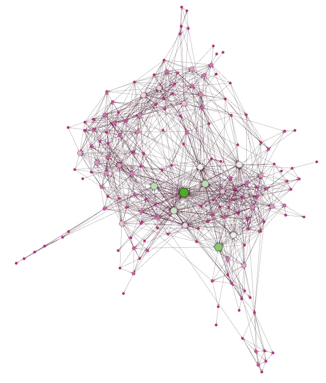 This is an example link chart image courtesy of Gephi
Intro to Gephi
While i2 Analyst’s Notebook is the industry standard for high-end link analysis, a powerful, free, and open-source alternative is Gephi. It’s a data visualization and exploration tool that is perfect for this kind of network analysis. It can be downloaded for free at gephi.org.
Basic Instructions for Gephi
I will not get into a full tutorial on how to use Gephi, but here are the basic steps to get your data imported and visualized.
- Download and Install Gephi.
- Start a New Project.
- Go to the “Data Laboratory” tab.
- Click “Import Spreadsheet”.
- Import
nodes.csvfirst. When the import dialog appears, make sure you select “Nodes table” from the dropdown. - Import
edges.csvnext. Gephi should automatically recognize it as an “Edges table.”
- Import
- Switch back to the “Overview” tab. You’ll see a jumbled mess of nodes and lines.
- In the “Layout” panel on the left, choose a layout algorithm like “ForceAtlas 2” and click “Run.” Let it run for a bit (sorry for the lack of specificity—it doesn’t get better with age), then click “Stop.” This will spread out the nodes and reveal the structure of your network.
You now have a visual map of your data! Click around, get acquainted with the interface, and take a look at what you’ve created. We are about to take the intelligence you just gathered to the next level by analyzing the structure of this map.
An Introduction to Social Network Analysis (SNA)
Social Network Analysis (SNA) is a powerful method for studying relationships between connected entities. It’s not about analyzing posts on X (formerly Twitter) or Facebook; it’s about using graph theory (a branch of mathematics that studies networks) to map and measure the connections within any network—be it people or computers—to find its most important and influential parts.
The power of SNA is that its principles are universal. It sees every network as a collection of two simple things: nodes (the individual items) and edges (the relationships connecting them). This is why a theory developed to study human social networks works perfectly for analyzing DNS data. In a human social network, nodes are people and edges are relationships (like friendship). In a DNS investigation, nodes are digital entities (domains, IPs, nameservers) and edges are technical relationships (an A record, a shared nameserver). The math used to find an influential person in a social circle is the exact same math used to find a critical C2 server in a botnet. By applying SNA, investigators can move beyond simple lists to find network choke points, identify central hubs, and strategically target the “kingpins” of malicious infrastructure.
Finding the Critical Nodes: Centrality Measures
Now that we know link analysis can do more than just draw pretty pictures, let’s perform a deeper analysis of our network. In Gephi, you can find these SNA metrics in the “Statistics” panel on the right. Here are the key ones and what they mean for an investigator.
Let’s imagine we’re tailgating outside of Highmark Stadium in the dead of winter for a Sunday night game where the Buffalo Bills finally crush the Kansas City Chiefs and progress to the Super Bowl (or insert your favorite sport, team, and arena where they’ve been deprived of victory too often). It’s your friends, my friends, and some friends of our friends, spread across several adjacent parking spots.
Degree Centrality: The “Busiest” Node
- What it is: The simplest measure. It’s a count of how many connections (edges) a node has.
- Analogy: This is Jeff. He was already a social butterfly, gets even chattier after a round or two, and is now talking to the most people at our collective tailgate.
- What it means for us: Nodes with a high degree are busy hubs. A shared nameserver or hosting IP will have a very high degree. It’s a good way to quickly identify shared infrastructure. Taking action against it may impact the network quickly, though possibly in a shallow way, as nameservers and IP addresses can be easily replaced.
Betweenness Centrality: The “Bridge” or “Broker”
- What it is: Measures how often a node lies on the shortest path between any two other nodes.
- Analogy: This is me, the person who connected your friend group and my friend group at our tailgate this brisk evening. These two otherwise separate friend groups might not interact here or possibly anywhere else in life without a common link.
- What it means for us: A node with high Betweenness Centrality is a critical bridge connecting different parts of an adversary’s network. Taking down this node can effectively split their infrastructure in two, disrupting communication and operations. Action against this node is far more likely to be disruptive.
Closeness Centrality: The “Most Efficient” Node
- What it is: Measures how close a node is to all other nodes in the network. A node with a high closeness score can reach everyone else in the fewest steps.
- Analogy: This is Kurt. He set his chair and cooler in the perfect spot equidistant from all the major groups. From his central position, he has the shortest average path to get to anyone at the party, be it someone at the grill or someone about to dive through a folding table. He is best positioned to spread news (or a round of libations) to the entire party the fastest. However, he is sitting right where people want to play cornhole.
- What it means for us: This often identifies the command-and-control (C2) or primary logistics server. It’s the node from which information (or malware commands) can be most efficiently distributed. Taking this node down would be highly disruptive and, depending on the C2’s complexity, could have a high impact on the network.
Eigenvector Centrality: The “Most Influential” Node
- What it is: The most sophisticated measure. It identifies nodes that are connected to other highly connected nodes. A high eigenvector score means a node is an influential hub within a powerful neighborhood.
- Analogy: While Jeff is talking to everyone at the tailgate, Amy is only talking to people who hold significance in the various friend groups: the office manager in one group, the favorite grandmother in another, the best friend of the influential spouse who isn’t present.
- What it means for us: This is often the kingpin. An IP address hosting just one nameserver might not seem important, but if that nameserver controls a hundred malicious domains, the IP’s eigenvector centrality will be high. Targeting the node with the highest eigenvector score will cause the most significant disruptive ripple effect across the entire network.
Applying the Analysis
By running these calculations in a tool like Gephi (found in the “Statistics” panel), you can then rank your indicators not just by their number of connections, but by their strategic importance. This allows you to ask targeted questions: Which node is the busiest (Degree)? Which is the most critical bridge (Betweenness)? And which is the true center of influence (Eigenvector)? The answers will guide your next steps, telling you which pieces of infrastructure are the most valuable to investigate further or report for takedown.
Now, I can hear the question:
Wait, can one node have the highest score for all measures? Is that always the case?
Yes, one node can absolutely have the highest score across multiple measures. In smaller, simpler networks, this is often the case. However, as your network grows to hundreds or thousands of nodes with complex interconnections, you will find that different nodes emerge as important for different reasons. You may have several nodes with similarly high scores, implying they share the same kind of importance. Conversely, if you graph several nodes that share no edges, you will get low centrality measures across the board.
Some Tips and Advice From Years of Experience
- You can absolutely add too many different types of nodes. Stick to frequently recurring, meaningful types. If you start adding fax numbers, Signal channels, and other data points that have nothing in common with the rest of your data, it can skew your analysis and make the graph harder to read.
- It is appropriate and encouraged to use the graph to find knowledge gaps and identify new leads. I have often found that I will create nearly a half-dozen versions of my charts as I keep iterating and finding more data.
- Creating a standalone group of nodes that doesn’t have any edge tying it back to the main group can be a sign that something you collected may not be related, or it may be challenging your assumption that it is. Or, maybe you just typo’d something.
- This technique is the only way I really learned to survive and make sense of an overwhelming amount of passive DNS data in some large investigations.
- If you are looking at shared IP space or nameservers, it may not be possible or worthwhile to pull in all related nodes. You will have to learn to strike a balance. If you absolutely need to import and capture everything, make sure you use a very powerful computer with lots of RAM and CPU to crunch the numbers. I have created charts that exceeded 64 GB of RAM and subsequently crashed the application (and sometimes, Windows).
- Presenting this information to decision makers can be challenging. Practice communicating what it means with someone else that kind of understands the data so that you have a chance at making this land as clearly as possible.
Conclusion
Moving from a flat list of indicators to a visualized network graph is a fundamental step in leveling up your investigative skills. It allows you to stop playing whack-a-mole with individual domains and start thinking strategically. By applying link analysis, you can identify the load-bearing pillars of an adversary’s infrastructure and direct your mitigation efforts where they will have the greatest impact.
And if you have done it all right, you may look, feel, and sound, just like Charlie.